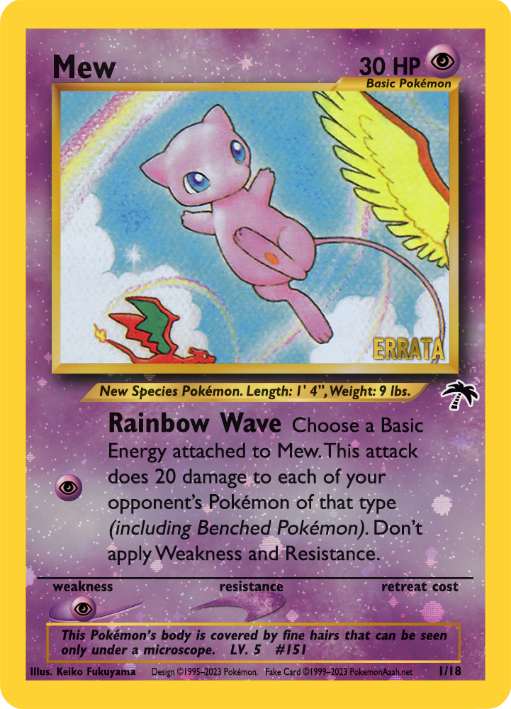
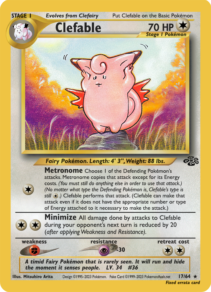
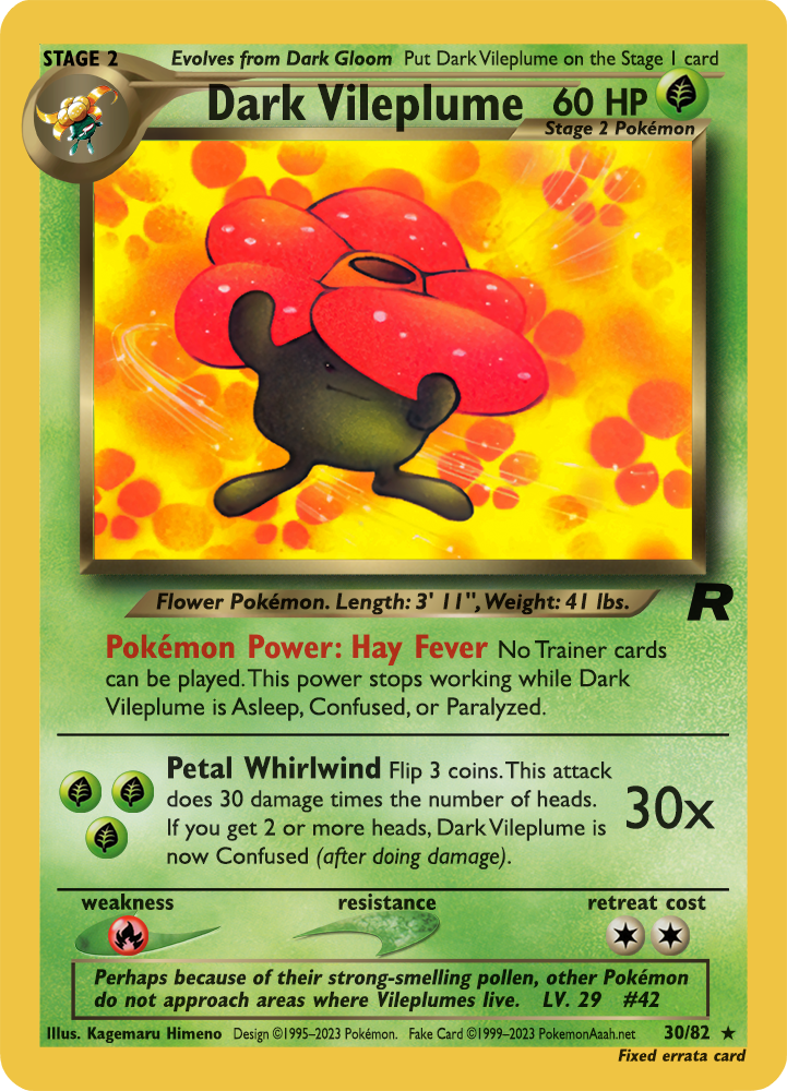
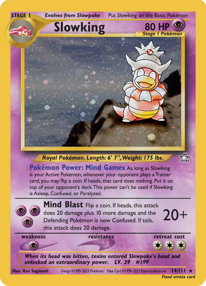
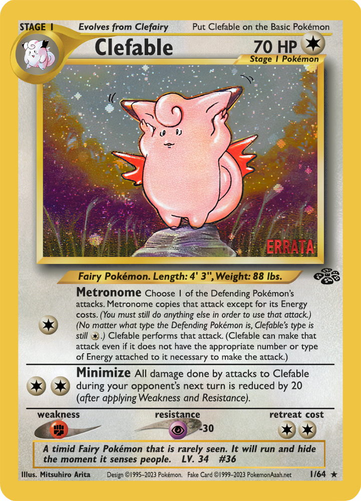
As we’ve discussed with @JasonKlaczynski and @admin in the past, It’d be nice to get cards with the fixed text to match up with their in-game effect I’ll be slowly going through them and posting them here ![]()
1 Like
These look so good. What talent you have! To avoid confusion, though, we need some kind of errata tag placed on the card. Where do you think this is best placed?
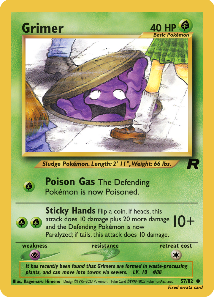
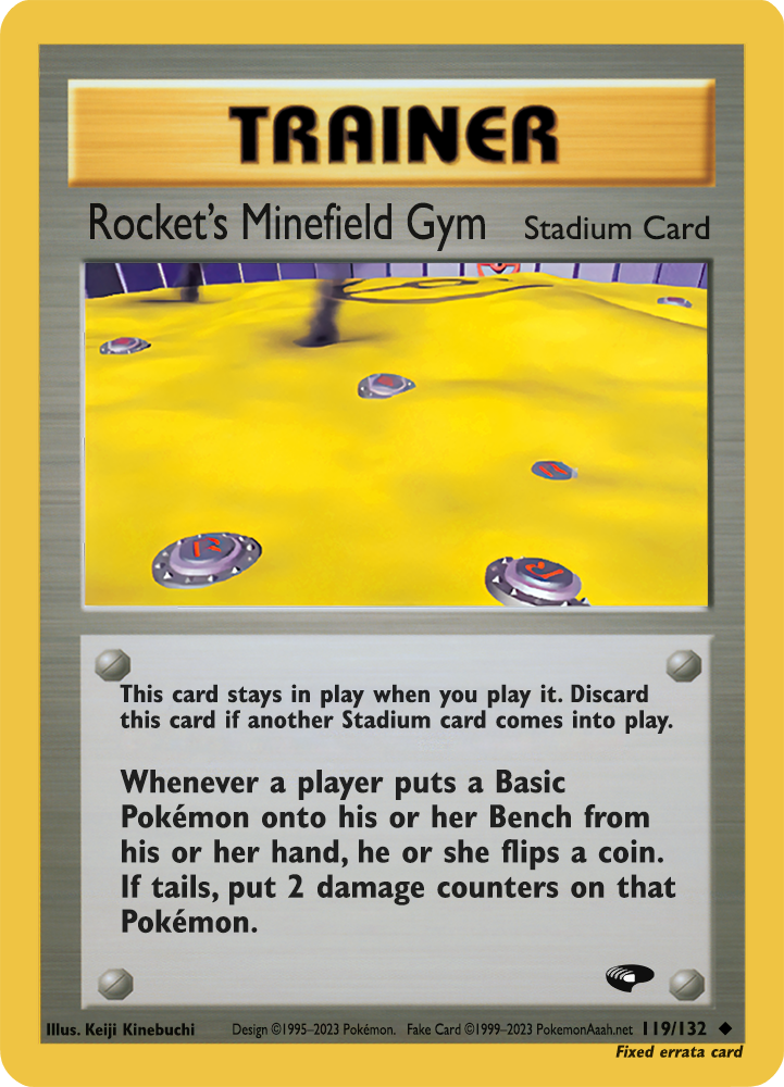
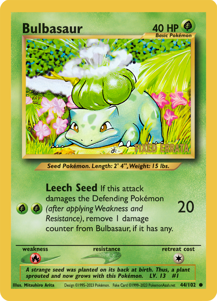
Also, just wanted to add that Rocket’s Minefield Gym did receive an official correct print, so it isn’t necessary to place an errata emblem on this card.
Amazing skills!
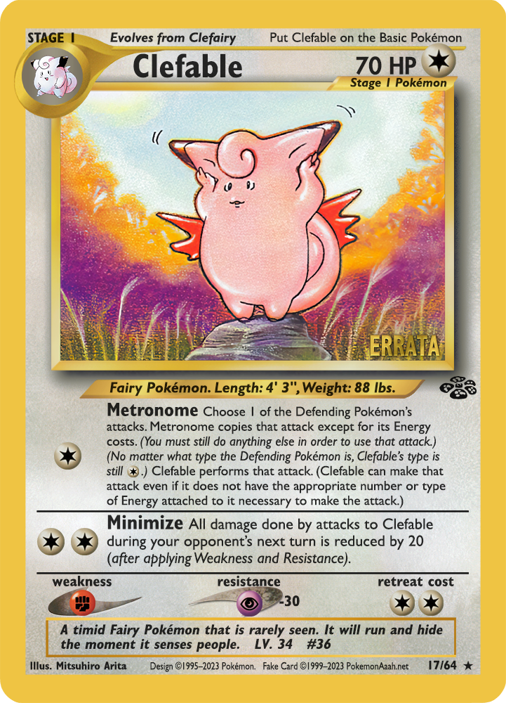
Suggestion for Metronome; this last sentence sounds like it can circumvent “in order to” clauses:
(Clefable can make that attack even if it does not have the appropriate number or type of Energy attached to it necessary to make the attack)
I think this bit can be removed since “… except for its Energy costs” clause effectively covers it.
Oh I did!, its very subdued, but I added the black text on the lower right border. I did it this way because its similar to what japanese cards did to explain where a card came from. I can do something more visible if needed. Let me know your thoughts!
Oh that text is stricly in regards to the attack cost. I can take it away, but the errata’d wording I based it on togetic’s super metronome and other similar attacks, to be consistent with WOTC wording. In practice it could be worded as simple as the tcg classic reprint ![]()
Just to add something @admin, @linkinboss’s skills extend beyond formatting the cards; he also extensively studies Wizards era wording in order to create consistency in card text of the cards he rewrites and translates. So whenever something seems written that’s a little bit off, it’s done deliberately to match the wording of other cards Wizards made from the era. You can trust he knows what he’s doing!
My preference would be an emblem placed on the card art. Because players outside of Japan played with many of these cards for years without realizing they were mistranslated, they will be caught off-guard when they see certain things functioning differently than expected. Because of this, I think the errata emblem should be more conspicuous.
So, I tried to go for something similar to the prerelease stamps, to make it look more or less legit (though I guess the color could be changed). Obviously depending on the color of the background it would be more or less readable, but it stands out more than the text in the lower corner. What do you think?
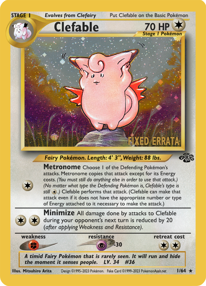
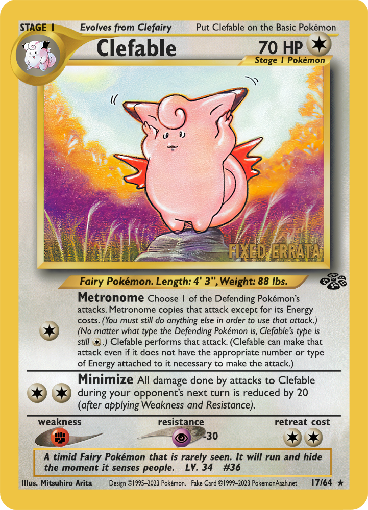
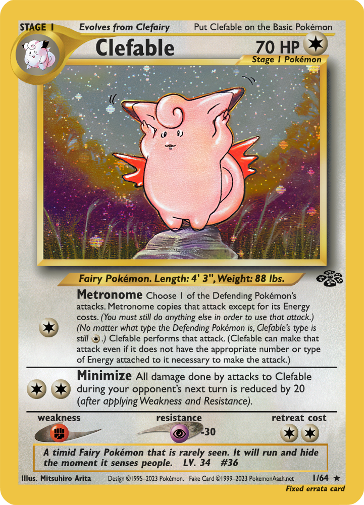
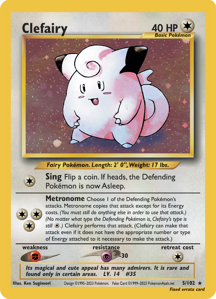
I’m generally fine with all of these as is since they are already huge improvements; but personally I’d prefer a smaller “ERRATA’D” or more gently, a special emblem (e.g. a ![]() ?) instead of “FIXED ERRATA”
?) instead of “FIXED ERRATA” ![]()
I agree with @admin; simply use “ERRATA” to indicate the card has been treated with an errata. (No ‘d, though; it isn’t even a verb.)
Only other suggestion would be a more noticeable font color, like red.
I was thinking that no matter what color I choose its still gonna be a card of the same color, so probably I’ll just invert colors on the illustration to find out the color that would stand out the most and do different colors per card.
Also, following @admin suggestion, would it be better if its a text on the frame of the illustration? Or would that be too tiny?
The location in the artwork seems preferable because it’s consistent with where other stamps, signatures, etc. go. I would try to maintain a consistent color by choosing one that is visible on most cards. I still favor a shade of red. Could I see what red looks like?
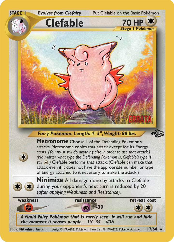
I like that and I think that’s consistent with how cards containing errata were displayed on PTCGO as well too. @admin thoughts?
@admin I’ll start uploading them to a drive, so they are easily accessible as I keep making more:
https://drive.google.com/drive/folders/1gn7oIhnwVFEqXX1Yy38WW7O0XCSqP-C1?usp=sharing
How about uploading them to the dropbox folder I shared before? We already used it for japanese promos so you may well create another top level folder and put them there.
Sure! I’m out for the weekend, but once I get back home I’ll do so
1 Like
I wish the font was still gold. It reminds me of the prerelease promos, which I think was the original intent. Even a red font could just blend in with the wrong background, so I think sticking with gold and giving the text a drop shadow border would be best. Not sure if it will still be reminiscent of prerelease promos after the drop shadow, but it will be closer to the desired look.
this is certainly doable… I toyed around with the shades a bit to make it more readable. I guess Clefable would be an example of the least noticeable background, what does everybody think? @Charmaster @JasonKlaczynski @admin