Hi folks, you may use this thread to post your UX feedbacks regarding the new UI at https://tcg.one. Please be as clear as possible. Thanks!
So far, I have three main complaints:
-I’m really not a fan of how everything outside of the game lobby is tied to the new tcg.one site. Not only is it annoying having to open so many new windows whenever you want to do anything, but the seamless experience of being able to play QuickPlay and Career, view a card database, and access/add to a collection of decks, all on the same website without having to navigate through webpages at all, was probably the best thing about the old site. This is more of a personal and fundamental grievance and I’m not sure if merging everything back into one site is something you’re able or willing to do, but that is my biggest criticism.
-The button for importing decks is in the “My Decks” section, which I think is needlessly confusing as opposed to just having it next to the “New Deck” button in the original Deck Garage page, not to mention that having the option tucked away just makes things take longer for the many players like myself who are regularly importing from LimitlessTCG.
-The GitHub links tied to the “View Card Definition” button under every card in the database seem to all be broken. Not something super important, but obviously something that you will want to fix at some point down the line.
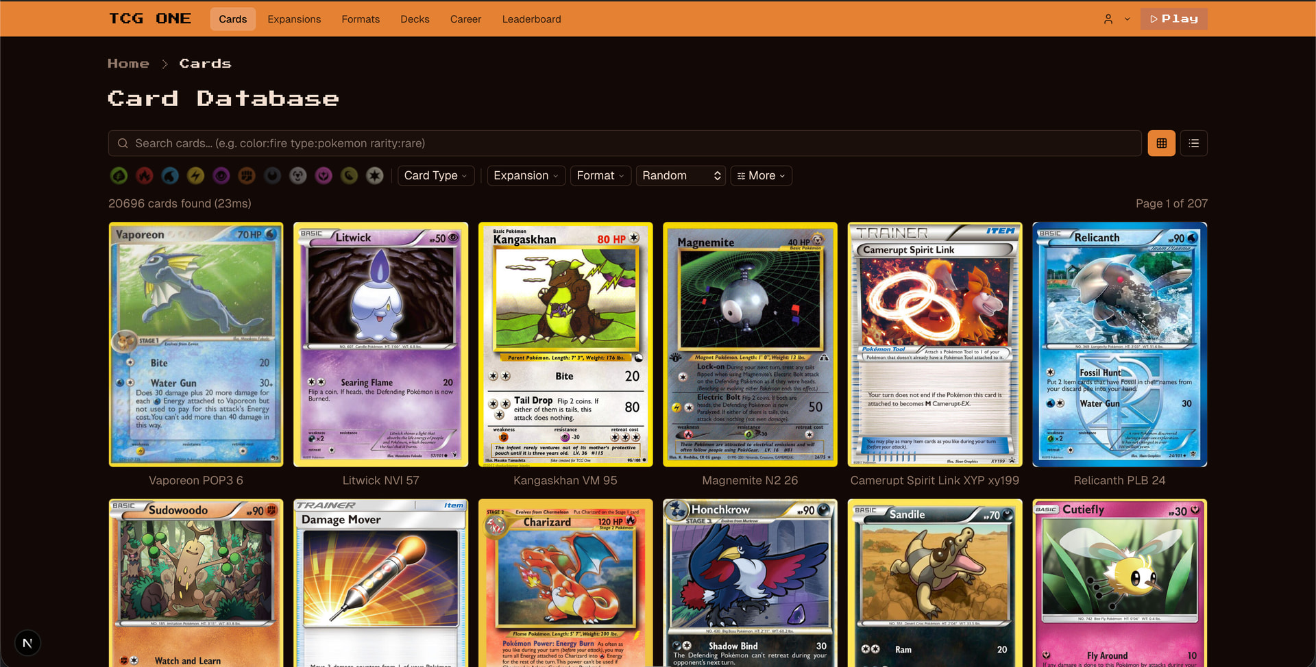
That talk about the card database also has me thinking that, if you’re going to be dedicating a whole webpage to looking at cards, the large amount of screen space could be taken advantage of to list all unresolved bug reports where the card you’re viewing was one of the two involved cards. I do appreciate how this space is already being used to show other information like what formats the card is legal in (maybe other prints of the same card could also be linked to?).
As far as searching for cards goes, I’ve noticed that you are no longer shown every single card that has the searched sequence of letters somewhere in its name, which has been both a positive and a negative. For example, it’s no longer a pain to find N and I know longer see every Mewtwo card when I search for Mew, which is probably preferred over the convenience of being able to be lazy and search something like “ray” or “quaza” to see Rayquaza cards, but it also means that simply searching “Surge” won’t show me Surge’s Pokémon from the Gym era, or trainer cards that similarly use his name in that way like Lt. Surge’s Secret Plan from Generation 1 or Lt. Surge’s Strategy from Generation 7 (this is just a minor annoyance and probably doesn’t need any fixing), and searching “gear” won’t show me Pokégear. The latter is a much bigger annoyance because searching “poke” still doesn’t show you cards with the accented e in their name. With something like Poké Ball, it’s two separate words you you can just search “ball”, but then you see all other “ball” cards like Ultra Ball and even Maxie’s Hidden Ball Trick. Either way, it’s an issue, so I would either outright make the normal letter e account for the accent, or add a button under the search bar that inserts the accented e.
I’ll try to keep my criticism constructive but blunt: too much time and effort is spent on developing features that no one asked for. No one wants the deck editor to open on a separate website. No one wants to be forced to close out a Word Editor every time they save a deck. No one needed battle and coin flip animations that must to be disabled at the start of every new game and can’t even be disabled in spectator matches.
For years, the biggest obstacle to progress on this site has been that there is a clear disconnect between what players actually want and the things you spend time developing. While everyone appreciates what you do, the things you seem to prioritize aren’t even in the Top 10 things that players want. Some of the added features, like finished games clogging the lobby—literally no one asked for that, your users are nearly unanimous that they don’t like it, and yet it persists. Why?
I think I can speak for 99% of us when I say that above all, players want a stable, lag-free website to play, with priority given to fixing bugs. Focusing on these redesigns is not only the wrong thing to prioritize, but moves the site in the wrong direction because each new update comes with additional issues: new bugs, lag, game engine errors, etc. Until we have every card and every format on a fully functional website, let’s not waste time with all of these redesigns, most of which cause lag and no one even asked for in the first place.
5 Likes
(One thing I will say is that I do like the animations in the games because it shows new players what’s going on. For example: They can visually see what cards are being played and the effect that happens immediately afterwards. With that being said, we definitely DO need a way to disable for the longtime players. Anyways, carry on.)
I definitely do agree that having a seperate window (for career… I think? Is it JUST career on a different page?) is very confusing even for a longtime player like me. Why not just have it all on one window? That’s so much less confusing and easier. I don’t know what caused this change too.
seconding jason’s comments. as a longtime player in RS-PK i very much prefer the site being able to handle high amounts of players and to play smoothly than virtually anything else.
2 Likes
I will say that animations should absolutely be off by default in (If not removed from) spectator mode, as it basically becomes impossible for spectators to comment or even leave games for up to multiple minutes at a time if both players are making moves at a brisk pace. At the very least spectators should be able to turn off animations. Having animations off by default on the player’s end or saving your preferences when you disable them for the first time would also be super helpful.
I also think that embedding a tutorial on the front of TCGONE’s home page is essential, as nearly every new player fails to even find out Quickplay exists until they ask players on the Discord server what the best way to get new cards is. I’m not even suggesting changing TCGONE’s UI, just putting a tutorial right where every person looking up TCGONE will find it immediately, and updating it whenever necessary.
1 Like
This seems like a good time for the community to weigh in on how much they value the Custom Formats feature Axpendix has considered spending tons of development time on in the near future. I’ve asked him to add Primal Clash through Guardians Rising (A popularly requested mid-season format) and Black and White through Evolutions and Black and White through Cosmic Eclipse (Which would allow the multiple tournament hosts running events for miscellaneous retro Expanded formats to use historically accurate rulings), and Axpendix mentioned that he’d prefer not to dilute the value of existing Quickplay formats with too many options and would save these more niche picks for when the Custom Formats feature is added. From what I can see, however, perhaps players don’t want Axpendix to spend any time developing a super complex feature like custom formats until the cards are mostly bug-free and the website is running smoothly, and would prefer him to add comparably low-effort and low-risk features like these formats in the very near future rather than wait years to get the ability to create them with a Custom Formats feature or receive that feature soon only for it to cause more lag on the website.
@JamesG , @GrayAnt213 , and @UCS , what say you? All three of you have hosted events for past Expanded formats, and I’m sure would like to continue doing it.
1 Like
Hello folks,
I appreciate the friendly responses your constructive criticism here.
A reason of the website revamp is that the existing platform is written in a legacy technology (Vaadin) which is not suitable for scaling upwards of 100-200 active users for a fast paced P2P game (can’t keep up with latency or memory requirements). A couple of years ago we continuously hit that ceiling when we were up to date with latest expansions. It was tough to have to turn back users and gate access to keep latencies under control (I remember it was extremely laggy). This was also around the time where the top features requested (by hundreds of players, with hard data) were mobile support, improve latency, better deck editor, animations, player/social level customizations, etc.
We’ve been losing those users silently due to lacking platform UX, e.g. non-responsive old style deck builder, high latencies for UI actions, old school design, no mobile support, no customizations, etc.
In the past years we’ve invested thousands of hours into fixing a ton of bugs, and this shows by the fact that many tournaments are being hosted on TCG ONE successfully.
Current user base are mostly the people who are the real fans of the Pokemon TCG and are fine with legacy UX as long as they can play efficiently without bugs or interruptions. And I thank you for your attention. However, this is only a fraction of global players.
Since I stopped casually playing TCG ONE 5+ years ago, I always ask this question to myself: what features I’d like to see in order for me to get back to playing this game as a casual player? The answers are varied but it’s almost always about the UX, accessibility and uniformity issues. But some answers are actually about changing the core rules of the game, because after playing many card games, I realize Pokemon TCG doesn’t really have the most balanced game rules (3 things I dislike: playing unlimited number of items and big basics in a single turn, hand disruptions and the sheer long duration of an average game). We’ll get to these points too, in time.
In the last few years I began splitting some functionality into new modules, which are also not providing a unified experience currently. My goal is to have a finer and more connected user experience across all features of the TCG ONE platform in a single application and also have it scale beyond 1000 concurrent players. This new site is the first step in that direction.
I must remind you the objectives and North Star metric: Monthly active returning players and number of active supporters.
In order to achieve these objectives and increase those metrics, we have to get out of the local maxima of the project’s position right now and move towards a global maxima, even though I hate to disappoint players, sometimes I have to break things, only to fix them shortly after in a better way. As the creator of the project, if I can’t move in the direction that I want to, I might as well just quit the whole thing.
In the last few years I began splitting some functionality into new modules, which are also not providing a unified experience currently. My goal is to have a finer and more connected user experience across all features of the TCG ONE platform in a single application. Which means more features will be ported soon.
This new http://tcg.one site is a new Next.js application (built almost entirely by Claude) which takes care of cards, expansions, formats, decks, and career mode. However the website is far from a perfect user experience state as of now. I need an experienced frontend/fullstack engineer to take care of styling, theming, character, fine tuning elements and components to improve UX, gather user feedback, setup and track metrics and some other finer details.
fixed
The link is working but only for ones with developer access. I shall see it removed for non-devs once we have global roles support across the platform.
I’ve updated the search to work with wildcards now, so you’ll get partial results while typing without necessarily typing entire word. If you want to search for the card “N”, use quotes, it works nicely.
Cheers
1 Like
What I would say to this is maybe there should be clearer communicaton on this instead of surprising players. I know you are expecting them to be upset, but giving them a heads up will definitely soften that blow.
Now that you explained, that makes a lot more sense. Moving a more modern site that will allow mobile play and more players adds up to me. Just be sure to keep us in the loop and maybe consider having a tutorial on how to use the new site.
Also, that means it will be on one site again eventually, so as long as we have that (AND PLEASE ADD A DARK MODE!), I’ll be happy about this move.
2 Likes
Can we compromise by having a user setting to disable animations for any games that they play or spectate? I don’t think Jason is as annoyed by the fact that animations exist as he is by having to check the box to disable them every time he plays a game. If he can go into his account settings, check a box once, and never have to see animations again, he should be satisfied.
(I’d like it if this setting could apply to the dev site too. Having animations on makes testing slower — not impossible, but slower.)
1 Like
We have actually been able to do exactly what you’re describing for half a year.
I am new into theming. Is this better?
This is already possible via a top corner “settings” panel; which affects both games played and spectated.
Will be added in next update.
Other Updates:
- [5/10 19:47] [admin]: I am aware Career game logs or scores are not saved properly at the moment, this will be fixed.
- [5/10 19:47] [admin]: 100 deck limit was an oversight and will be restored too.
1 Like
On the new site, I’d like something similar to what the old version of the deck builder had where clicking on a card highlighted it and then you could just click/hold left or right on your keyboard to add/subtract more copies of the card to the deck.
On a similar note, while a Notes function is a nice idea, its implementation as a mandatory check-out of sorts when saving decks is a point of annoyance for many users, myself included.
On a positive note, the ability to filter by Weakness/Resistance/Other Factors is a fantastic addition that I loved seeing added.
This last thing is a shot in the dark as I’m not sure how it would be implemented in terms of format-legality, but addition of Japanese-exclusive cards would be neat.
3 Likes
Hmm, why so we can! Wasn’t aware of this button. (Again, this is why we need an official tutorial that gets updated when features are changed or added.)
I wish the “Skip Coin Flip Animations” and “Skip Card and Battle Animations” were split into more categories. Ideally we’d have:
- Skip coin flip animations when playing
- Skip coin flip animations when spectating
- Skip card animations when playing
- Skip card animations when spectating
- Skip battle animations when playing
- Skip battle animations when spectating
Now that I’ve thought about it, I realize I find the card animations kind of annoying and the battle animations cool, and the idea of being able to keep the cool animations when I attack (Battle animation) while not having every card that gets played get thrown in my face (Card animation) as it gets played is super appealing.
Anyways, tagging @JasonKlaczynski since he also didn’t find out that the settings to permanently turn off animations already exist. I wonder how many people actually managed to figure out those settings existed without being told by other players.
This was also around the time where the top features requested (by hundreds of players, with hard data) were mobile support, improve latency, better deck editor, animations, player/social level customizations, etc. We’ve been losing those users silently due to lacking platform UX, e.g. non-responsive old style deck builder, high latencies for UI actions, old school design, no mobile support, no customizations, etc.
A few things I’d like to ask. First, how do we get these users back onto TCGONE? And how many of them would come now that we’re no longer in-line with Standard?
Second, where can we find this data? I’m sure many of us would be interested in seeing it.
Since I stopped casually playing TCG ONE 5+ years ago, I always ask this question to myself: what features I’d like to see in order for me to get back to playing this game as a casual player? The answers are varied but it’s almost always about the UX, accessibility and uniformity issues. But some answers are actually about changing the core rules of the game, because after playing many card games, I realize Pokemon TCG doesn’t really have the most balanced game rules (3 things I dislike: playing unlimited number of items and big basics in a single turn, hand disruptions and the sheer long duration of an average game). We’ll get to these points too, in time.
Interesting. How do you intend on solving the latter goal?
One feature that I think would be valuable would be the ability to create and play decks with more or less than 60 cards, or to have the option to exceed the four card limit. One popular alternative Pokémon card format is the Build and Battle format, a draft format at pre-releases where players can create 40 card decks with no limit on the number of cards with the same name you could use. Japan has also had official tournaments where players used 30 card decks. 20 card decks could be fun to use in casual play in the aftermath of the Pokémon Trading Card Game Pocket (Which could certainly solve the game length problem). 100 card decks are not unheard of in casual home-brewed formats. And there was even a large Japanese tournament where every player had to run a Computer Error as a 61st card.
1 Like
Definitely liking that dark mode look! ![]()
1 Like
What I was interested in was deck statistics, although I think functionality and the ability to host more players should be a priority. Things like chances of drawing an energy or a basic could be useful in the deck editor. I like the design of the older deck builder a bit better as of now. I would not mind card sparkle animations on the picture so long as they do not interfere with the text or the card itself. I feel like a green background would be nice for the “new” part of TCGONE, or at least a Dark mode, as others have said. I like the text sizes, although a big text drop-down menu may be better. I surely recommend a dual-screen computer if you are using Claude! Maybe some players could help volunteer to make an official tutorial to TCGone!
That’s my 2 cents. I know it’s a lot of thoughts!
Firstly before I delve into my feedback I’d welcome that this site has had tremendous strides to create a functioning tabletop simulator that works wonders for old school pokemon formats. Here are some things I’d possibly like to see added to the service.
- Before you are able to cast a pokemon trainer card or any card in general, you are able to click on the card to activate the effect of the card or to read its effects as I for one myself do this frequently.
- It would be great to see a stylized profiling for players to customize their profiles with pictures of favorite cards and include bios etc (duelingbook for example does a great job at this)
- When I click on my opponents card while they are in mid combo I find that I can’t exit out of the card viewing until there is a lull in their combo so real time match viewing becomes a hassle.
- Otherwise that’s about it, kabutops steelix best deck
1 Like
I tried using the new deck builder. Feedback here. It’s very image-heavy, so I put it in a Google doc instead of a forum post for ease of editing.
3 Likes
I have trouble reloading old decks easily and moving decks between career and quickplay easily. That would be high on my list of fixes.